In the modern digital landscape, your website is often the very first interaction a potential customer has with your brand. Think of it as your primary storefront. If that storefront doesn’t perform perfectly on the device they are using—whether it’s a smartphone, a tablet, or a desktop—you’re not just providing a poor experience; you’re actively losing business.
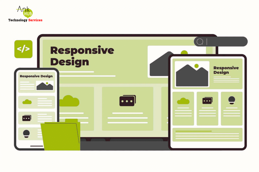
In 2025, Responsive Web Design (RWD) isn’t a design trend; it is the non-negotiable foundation of digital success. RWD ensures that your content automatically adjusts its layout, images, and functionality to fit any screen size, guaranteeing a seamless experience everywhere. Here is why RWD is the single most critical investment for sustained business growth this year.
1. The Mobile Traffic Imperative and High Bounce Rates
The data speaks for itself: over 70% of global web traffic now originates from mobile devices. This percentage continues its upward trajectory in 2025 as consumers rely on smartphones for everything from product research and purchasing to B2B communications.
For any business, this means your audience is overwhelmingly mobile. If your site requires a user to pinch, zoom, or horizontally scroll to view content on their phone, they will leave immediately. This non-responsive friction results in instant frustration, high bounce rates, and the immediate loss of the vast majority of your market. Responsive design is simply the cost of admission to the mobile-dominated internet.
2. Guaranteed SEO Improvement Through Mobile-First Indexing
Responsive design is not just a user experience feature—it is a critical SEO factor. Google cemented its commitment to RWD with its move to mobile-first indexing. This means Google primarily uses the mobile version of your website to determine its ranking and indexing.
A responsive design naturally boosts your SEO performance because it ensures you have:
- A Single URL: Eliminating separate mobile sites (like m.yoursite.com) makes it easier for search engines to crawl, index, and manage your content efficiently.
- Faster Loading Speeds: Responsive sites are designed to serve appropriately sized images and optimized code, which dramatically improves the crucial mobile load speed metric.
- Lower Bounce Rates: Good user engagement signals trust and quality to Google, translating directly into better search visibility.
If your site isn’t mobile-optimized, it is far less likely to appear prominently in search results, effectively handing qualified leads and organic traffic to responsive competitors.
3. Enhancing User Experience (UX) to Maximize Conversions
A positive user experience is the fastest route to increased conversions. When a user finds a website easy to navigate, fast to load, and pleasant to read, they are more likely to complete a desired action—whether that’s signing up for a newsletter, downloading an eBook, or making a purchase.
RWD provides a frictionless path for your customers by offering:
- Readable Text: Content is always sized correctly, eliminating the need for zooming.
- Accessible Buttons: Touch targets (buttons and links) are appropriately sized and spaced for easy tapping.
- Consistent Flow: The navigation, branding, and layout remain consistent across devices, building brand familiarity and trust.
This seamless experience leads to longer session times, deeper content engagement, and, most importantly, higher Conversion Rates.
4. Cost-Effective Maintenance and Scalability for Digital Platforms
Before RWD became the standard, businesses often had to create two separate websites: one for desktop and one for mobile (the “m-dot” site). This approach multiplied costs and complexity.
Responsive design offers a single, unified solution with one codebase. This inherent efficiency delivers significant long-term cost savings and improves sustainability:
- Lower Maintenance: You only have one system to update, maintain, and debug.
- Simplified Analytics: Tracking user behavior and segmenting audiences is simpler when all traffic flows through a single platform.
- Faster Deployment: Any new feature, content update, or security patch goes live across all devices simultaneously.
In 2025, where efficiency is paramount, RWD provides the most scalable and cost-effective foundation for your digital platform.
5. Future-Proofing Your Online Presence for Digital Continuity
Technology evolves faster than any business can redesign. Every year brings new form factors: foldable phones, oversized tablets, specialized desktop monitors, and smart wearables.
A responsive website, built on a flexible, grid-based layout, is intrinsically future-proof. It doesn’t rely on fixed dimensions. Instead, it adapts to the capabilities of the user’s device. By adopting RWD, you ensure that no matter what screen size or device type emerges next, your site will remain functional, accessible, and visually appealing without requiring a costly and time-consuming overhaul. You invest once in flexibility, securing your digital continuity for years to come.
Final Thoughts: The Cost of Inaction
In 2025, a responsive website is not a competitive advantage; it is a competitive necessity. It enhances user experience, maximizes your organic reach, increases conversions, and future-proofs your entire digital operation. If your business isn’t prioritizing RWD, you are effectively giving the 70% mobile audience to your competitors.
FAQs:
1. What is the main goal of RWD?
The main goal is to create a website that adapts to different devices and screen sizes, offering an optimal viewing experience for all users.
2. How does RWD impact Google SEO?
Google favors mobile-friendly websites, and responsive design improves loading speed, user engagement, and crawlability — all of which boost SEO rankings.
3. Is RWD more cost-effective than a separate mobile site?
Yes. While the initial investment may be higher than a basic static site, it saves money in the long term through reduced maintenance and a single analytics platform.
4. How can I check if my website is responsive?
Use tools like Google’s Mobile-Friendly Test or simply resize your browser window on a desktop to see if the content adjusts smoothly.
5. How Long Does a Responsive Redesign Typically Take?
The timeline varies significantly based on complexity, but a typical comprehensive redesign can take anywhere from 8 to 16 weeks from planning to launch.